RMIT Visual Identity
CLOSE

Role – Brand Manager/Project Lead
Background
The reputation of RMIT as a design and technology led university (and THE choice for creatives in one of the most creative cities in the world) was not being reflected by the institution’s visual identity. It was corporate, cold and limited, sending no strong voice into the market.
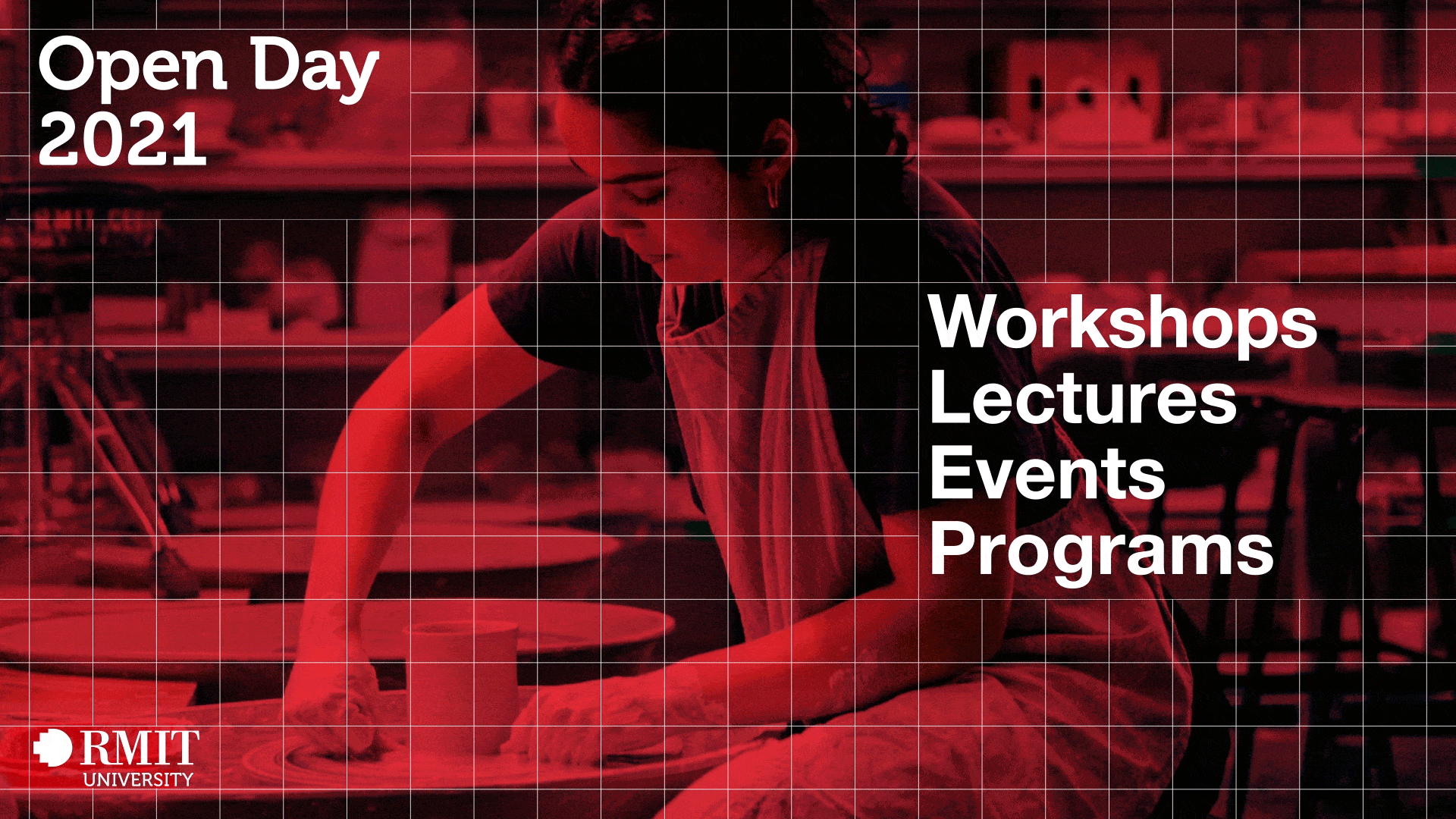
Idea
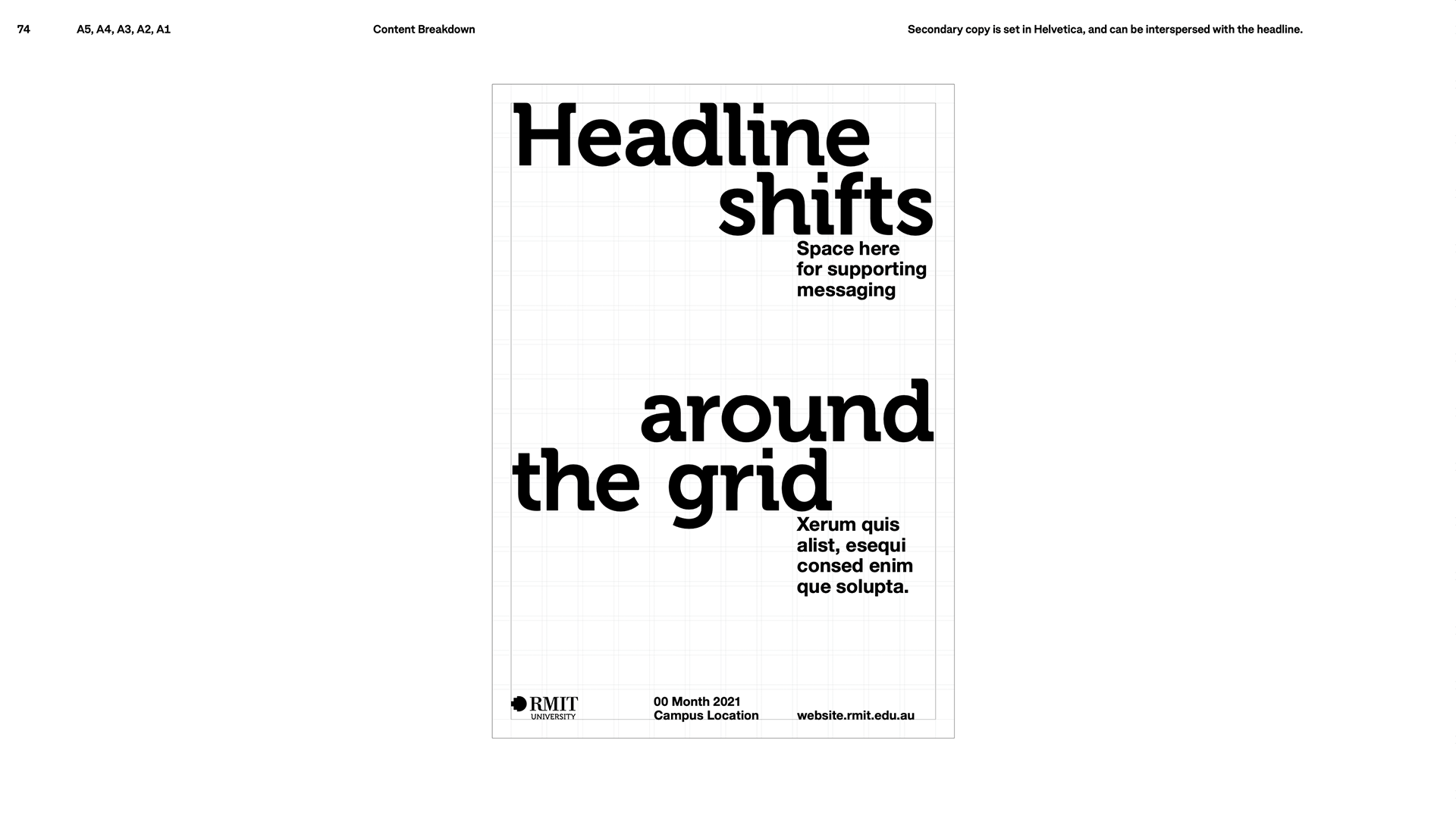
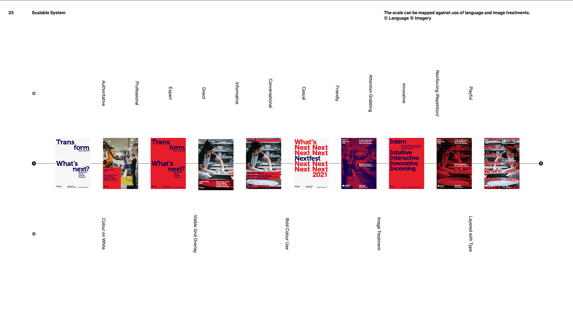
I wanted to lead the creation of not only a new set of brand guidelines, but a design system. One that could be flexible and speak to RMIT’s many audiences (that vary greatly in age and interest) but still hold strong to a core look that could drive brand awareness.

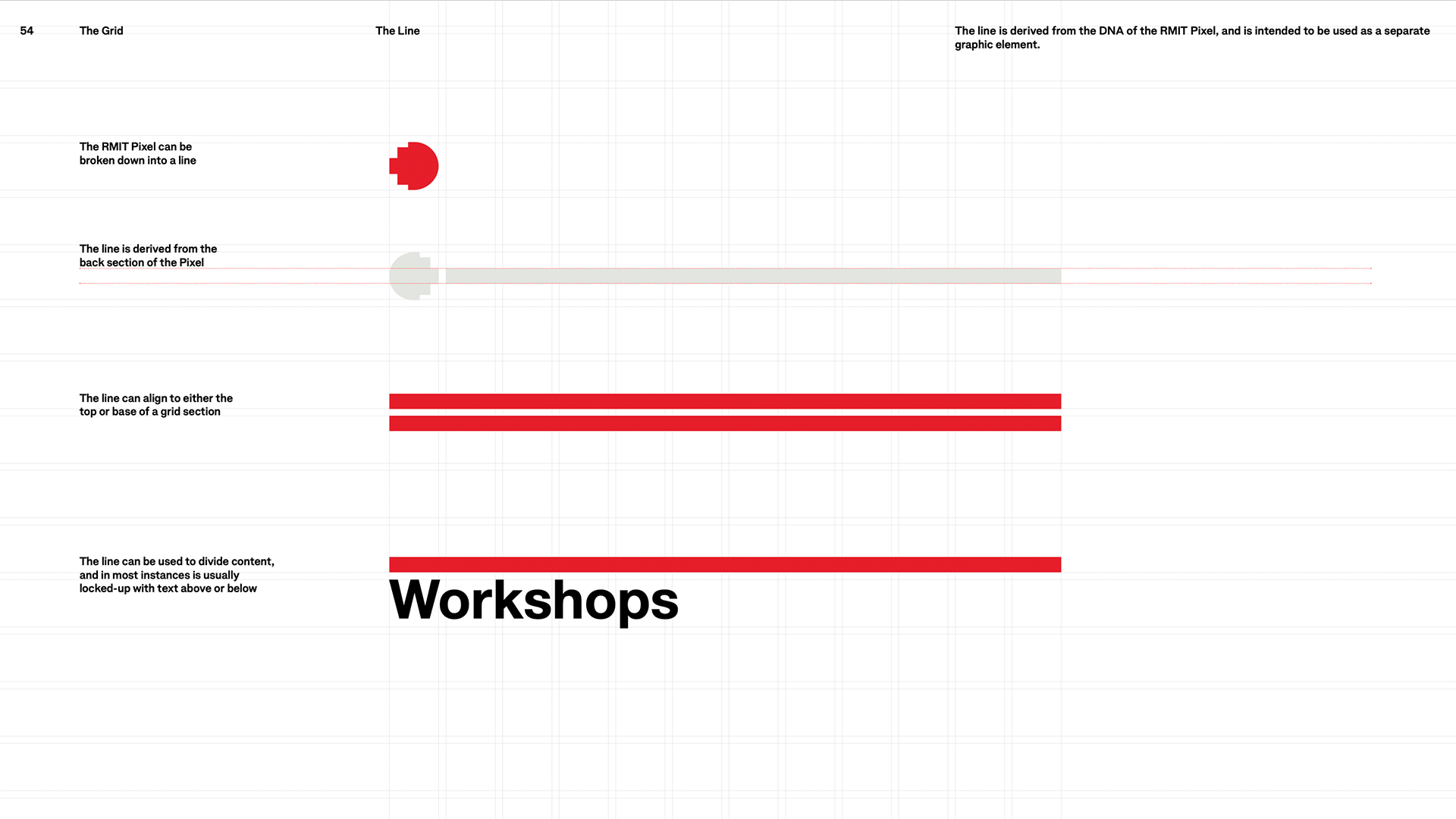

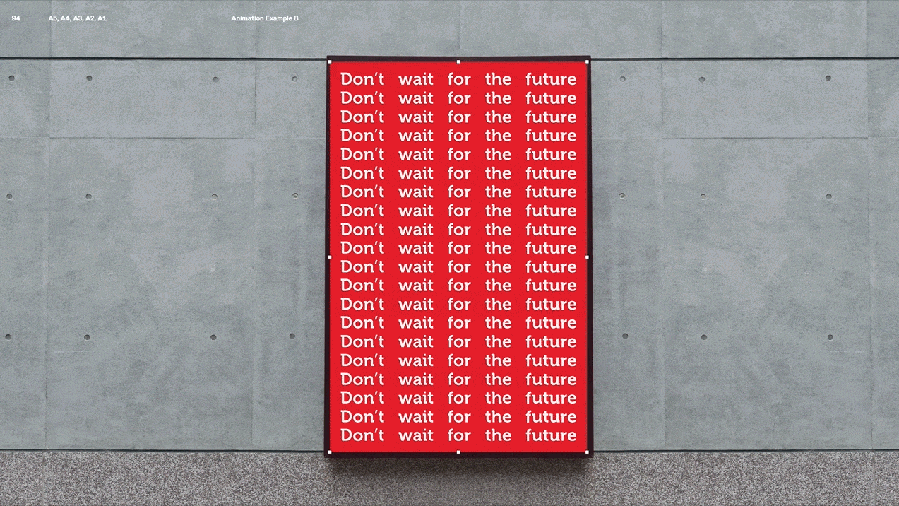
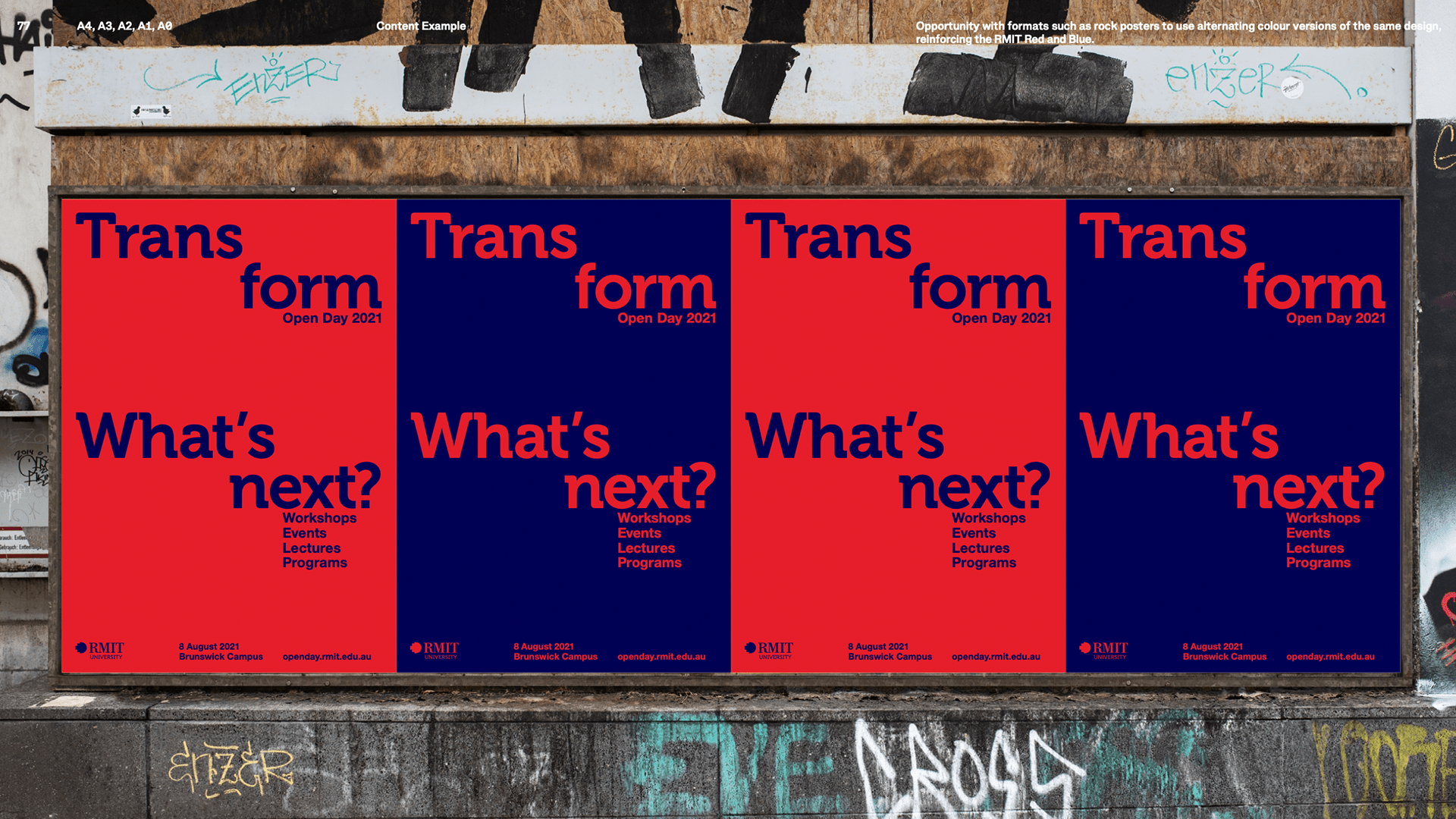
Working with design studio The Company You Keep, I created a system that allowed for the clear and structured presentation of information, whilst also being true to RMIT’s progressive and creative heart.
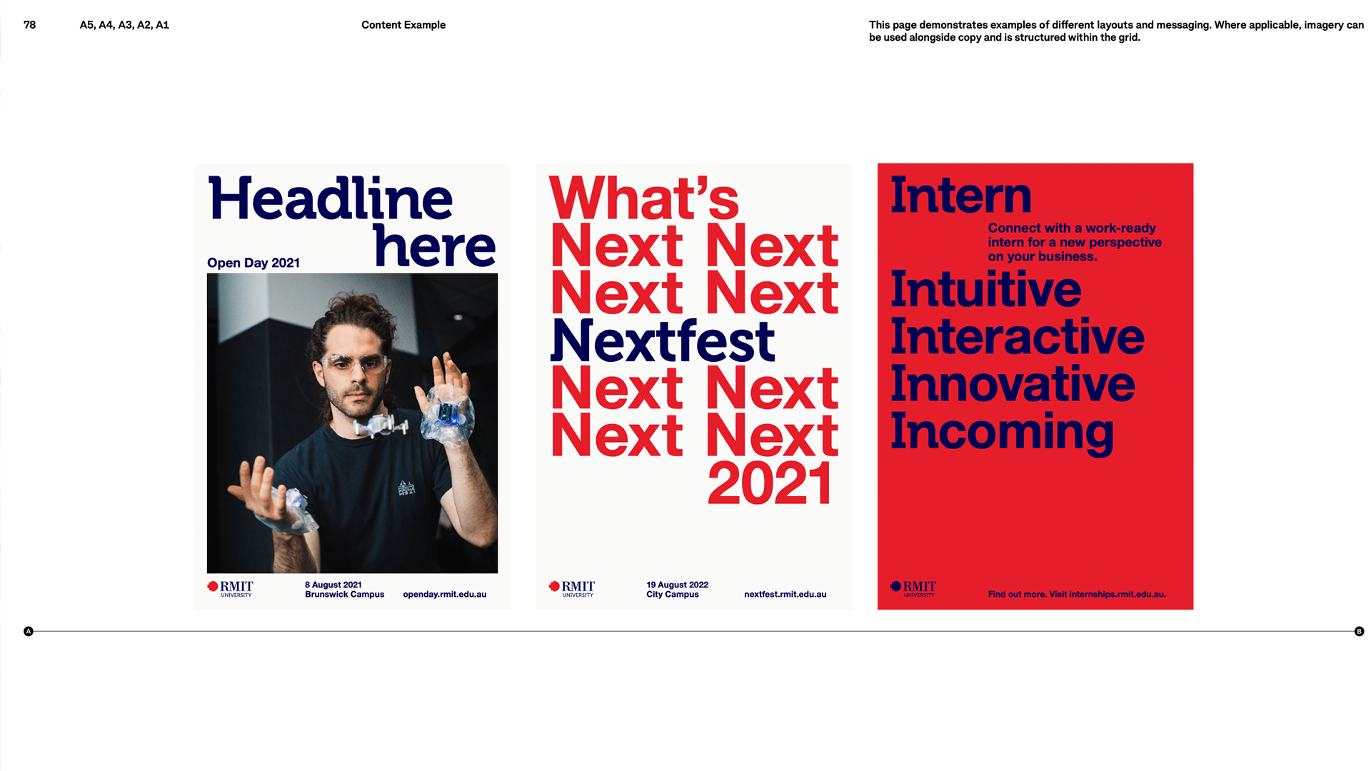
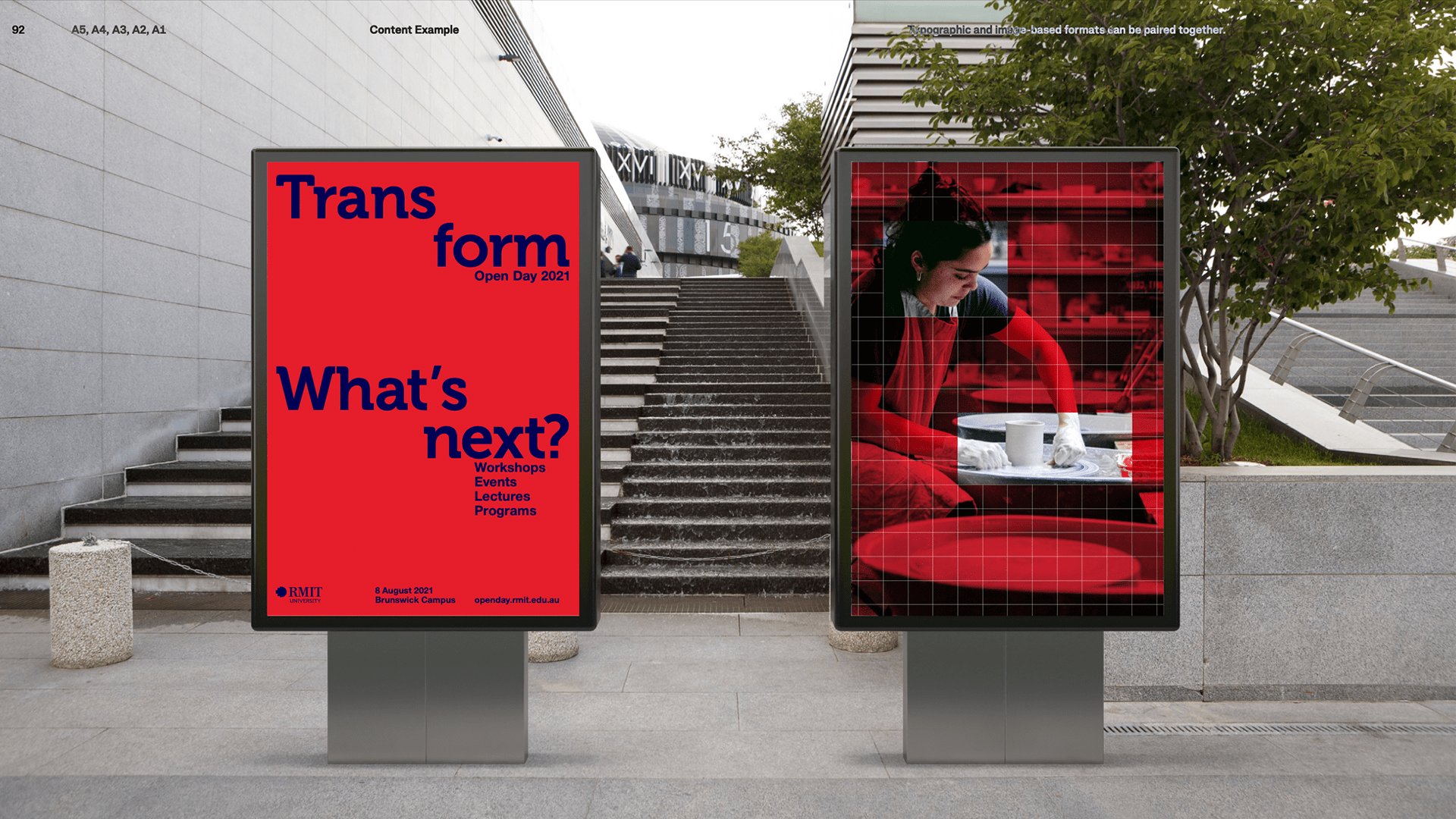
The system included a whole new suite of typographic looks and animated type applications across all of RMIT’s channels.
I also wanted to revamp the animation of the brand marque, to bring RMIT’s iconic pixel and logo to life. Many iterations of an animated marque were being used across the university but I saw the opportunity to have a consistent and strong version that would act as the guiding movement for RMIT.

I also saw the opportunity to have some guidelines around this animated brand marque that would allow for the creation of subject matter specific versions that could be paired with the relevant applications. An RMIT logo that is built of wood when speaking about our trades courses, one built of the coloured eucalyptus leaves of our Indigenous branding when speaking about our projects with First Nations people.
Design Studio – The Company You Keep
RMIT team – Olivia Villani, Hilary Jones, Joanne Chow, Rubin Kumar